HEADER:
I like the size and font, not sure how much I like the color. There's nothing wrong with it, per se, but I just feel like the navy blue is really dark next to the pretty green color.

I like the font of 'prone to wander' but might change 'Winstead' somehow. I do like the colour choices though but might also try to make it span across the page a little more.
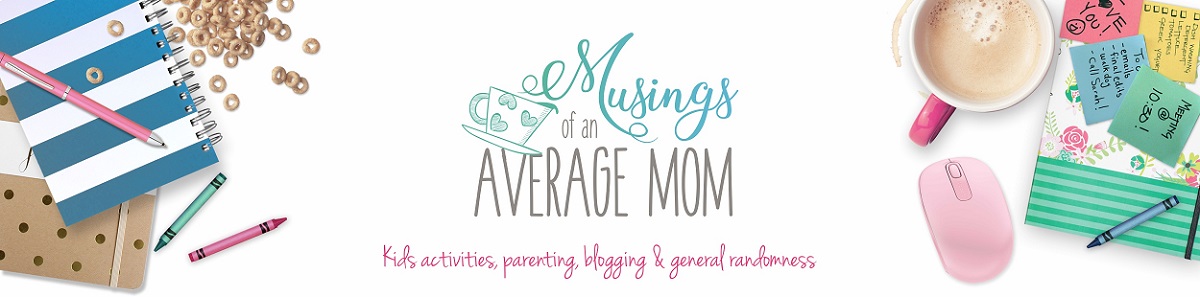
I enjoyed the minimalist approach with
the sidebar and header, although I will say that it's nice when you see a
logo that just 'pops'
the sidebar and header, although I will say that it's nice when you see a
logo that just 'pops'
It's not bad but I'm not sure that the pattern at the top works with the stripes on the side.
SIDEBAR (appearance and arrangement)
Place your mailing list widget above social media. I know everyone
pushes the social media icons, but recently I've found that when you have
too many options (all social icons plus mailing list), people get
overwhelmed. Would you rather have them like your facebook page or sign up
to your mailing list? For me, I'd rather have readers sign up for my list,
so I can send messages directly to them and not worry about timing on
social media. Conversions from mailing lists are higher than social click
throughs. This is all personal choice, but I thought I would bring it to
your attention.
Looks really nice and clean. Even though there are a lot of ads, it's still pretty to look at and not overwhelming where it would get ignored.
I think her sidebar is great, but she has the ability to utilize it more. There is a lot of empty space at the bottom that can be utilized!
love that the first things you see on the sidebar, above the fold, are social media buttons and the blogger's "thumbnail biography." This gives me the impression that this blog is not all about ads; it's about a blogger who has something to say, and who wants to connect with you.
On the sidebar under the fold, the search button is well-placed. I would recommend placing the popular posts list higher, and maybe increase to show a few more top posts. Personally, when I am exploring a blog, I like to see what other readers "recommend."
Place your mailing list widget above social media. I know everyone
pushes the social media icons, but recently I've found that when you have
too many options (all social icons plus mailing list), people get
overwhelmed. Would you rather have them like your facebook page or sign up
to your mailing list? For me, I'd rather have readers sign up for my list,
so I can send messages directly to them and not worry about timing on
social media. Conversions from mailing lists are higher than social click
throughs. This is all personal choice, but I thought I would bring it to
your attention.
pushes the social media icons, but recently I've found that when you have
too many options (all social icons plus mailing list), people get
overwhelmed. Would you rather have them like your facebook page or sign up
to your mailing list? For me, I'd rather have readers sign up for my list,
so I can send messages directly to them and not worry about timing on
social media. Conversions from mailing lists are higher than social click
throughs. This is all personal choice, but I thought I would bring it to
your attention.
Love that the SM buttons and "about" are the first things you see. I think the sidebar is well done.
HOW EASY IT IS TO FOLLOW ON SOCIAL MEDIA:
Very easy: right at the top of the page, each picture has a pin-it button. I'm not sure if it's because of my operating system (probably) but I see 2 pin its on each picture.
The social media buttons are prominent, look good, and work fine.
CONTENT
Very pretty pictures, some topics that aren't in my personal niche, but I'm sure would be fun for others. Love the recipes and blogging tips! Good titles.
I think she needs to take her main page off entire posts and just have a summary the post. I think it looks more professional, and it's easier for the reader to go through content if it's a summary instead of the whole post.
She has a fun style of writing. I liked her on all social accounts.
A comment about the photos and other graphics: they are great! Proof of this is the fact that I have previously read many of the blog posts. Obviously, I noticed them in a linky party list or something like that, and the photo/blog title drew me in
The posts are well-organized. Not too wordy. No enormous, long paragraphs. And you seem to write about what you know.
I enjoyed the story behind your brown sugar pound cake. And I respect that you referenced the owner of the original recipe, even though it was something you had modified and made your own.
When writing a post, insert a "read more" button. It helps readers
because they don't end up scrolling forever, and it helps you, the
blogger, because you can see what posts people click on the most, and what
hooks people to read more.
because they don't end up scrolling forever, and it helps you, the
blogger, because you can see what posts people click on the most, and what
hooks people to read more.
I enjoyed looking around and reading. I was easily sucked
into posts, and stopped skimming. And that says a lot, when readers can
sit back and not actually FEEL like they are reading! I think you are a
talented writer and I wish you the best!"
into posts, and stopped skimming. And that says a lot, when readers can
sit back and not actually FEEL like they are reading! I think you are a
talented writer and I wish you the best!"
I liked the content. You didn't have many pictures for the peach cobbler recipe but you do include more for your other recipes. All the recipes looked great and the other content was relevant to me as well. I liked "5 mistakes you make as a blogger", playdough making and several others. Overall, I enjoyed your content!
When writing a post, insert a "read more" button. It helps readers
because they don't end up scrolling forever, and it helps you, the
blogger, because you can see what posts people click on the most, and what
hooks people to read more.
because they don't end up scrolling forever, and it helps you, the
blogger, because you can see what posts people click on the most, and what
hooks people to read more.
HOW EASY IT IS TO READ (fonts, etc.)
Very easy to read, very clean, good white space. Pictures, subtitles, help to break it up.
As for readability, I think the fonts are a bit small and a bit light. (I like the color, though! Maybe you could go with the same font, but bold and/or a bit bigger?)
As for font, I think it would be nice to have her headers (H1, H2, H3) a bigger size or a different color. That would help break up the text for easy reading.
HOW EASY IT IS TO NAVIGATE:
Search bar + page titles make it easy to pick out just what you are interested in
I think the main navigation menu font needs to be bigger.
Her archive pages are awesome. I love the one main picture of the topic "frugality, life, etc" and then a list of the articles. Awesome sauce! Since we are visual people, I would suggest a thumbnail image there too in the archive pages, if that is possible. But if not, it still looks great. Her featured images are very pleasant.
I found it easy to use the topic links at the top of the blog to peruse the posts on different subjects. The light teal font color against the white background is a bit hard to read, but otherwise, the lists were well-organized and helpful.
While your posts popped up under the categories, I would suggest adding pictures too, instead of just links.
OVERALL APPEARANCE
Beautiful layout and looks very professional. Pleasing to the eye and lots of gorgeous pics!

Love the color scheme. It is very flattering, and easy for the eyes to read. That's a hard balance to achieve, but she's got it.
Font and content all easy to read. I enjoyed the minimalist approach with
the sidebar and header, although I will say that it's nice when you see a
logo that just 'pops'.
the sidebar and header, although I will say that it's nice when you see a
logo that just 'pops'.
My first impression of this blog, based on the appearance alone, is clean, serene and contemporary. I really like the color scheme and the mix of patterns.
I didn't love the stripes combined with the pattern at the top. I would pick just one and simplify the other.
OTHER COMMENTS OR SUGGESTIONS
Keep up the great work! :)
I think you have good content but you may want to change your tagline. I think "prone to wander" makes it sound like it's going to be a blog about traveling (maybe that's just me though). Glad I discovered your blog though because I'm definitely going to try a couple of your recipes!
It's a nice blog! Great job, Abby!
Other than that, I enjoyed looking around and reading. I was easily sucked
into posts, and stopped skimming. And that says a lot, when readers can
sit back and not actually FEEL like they are reading! I think you are a
talented writer and I wish you the best!"
into posts, and stopped skimming. And that says a lot, when readers can
sit back and not actually FEEL like they are reading! I think you are a
talented writer and I wish you the best!"
No comments:
Post a Comment